Okay, I admit it. I’m somewhat of a data junkie. I guess that’s an unintended consequence of my day job as an intelligence analyst (long story). So bottom line, I’m always looking for patterns and trends in large or small data sets that might provide insights that people can use to better their performance or to “one up” their competitors.
With this in mind, I figured I’d apply this to OWC – with all of you as the beneficiaries of this “lake intelligence.”
Here’s the skinny – I took all of water temperature readings that I, Dave, and others have secured since 2008, and I plotted them out to see if there was anything interesting in the results. To do this, I had to go back through all of the OWC swim reports and Facebook postings – a rather monumental task given that there were a TON of lake temperature postings. But the results are really quite fascinating.
So let’s take a look…
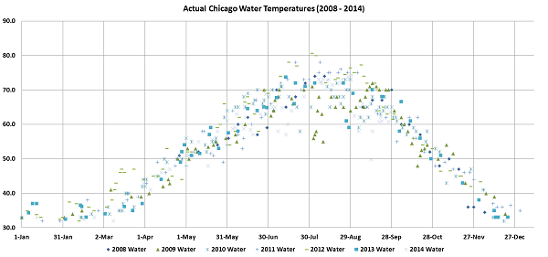
First, here is a scatter plot of the all of the lake temperature readings we took from April 2008 to the present:
[Click on the image to view a larger size file]
You can see that the temperature ranges were fairly consistent throughout the year. However, there were some rather surprising outliers in 2009 and 2014 – especially in the months of July, August and September. Also, 2012 had unusually warmer overall water temperatures – which we certainly exploited in attempting to extend our “non-wetsuit” streak that year!
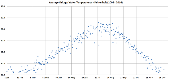
But let’s refine this a bit further. If we were to take the average of the days where we had readings from multiple years, we’d get this:
[Click on the image to view a larger size file]
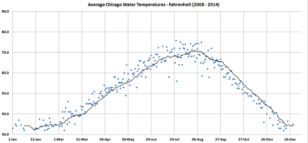
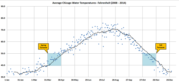
That’s a bit more polished, but we still have those outliers on days where we have no comparable data in the other years. So if we add a moving average trend line to this graph, we get this:
[Click on the image to view a larger size file]
While water temperatures can be quite dynamic, I believe this trend line is a pretty good predictor of what you are likely to experience while swimming out at the lake (within a certain range, of course).
And it’s worth noting that these are actual lake temperature readings taken at the swim sites with most of these being recorded in-swim. In other words, these are not offshore buoy readings or temperature forecasts that you get on most of the Lake Michigan news and weather sites!
So there you have it. Now you have some good insights you can use to hopefully better your Chicago Lake Michigan swim experience!
—–
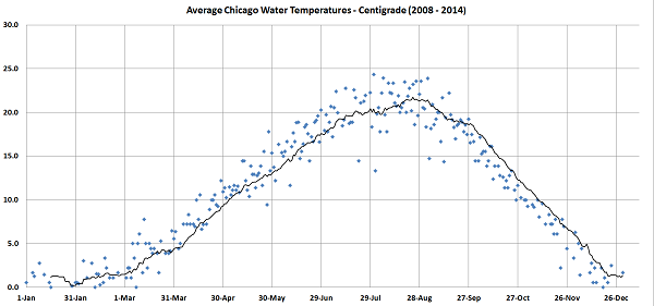
P.S. For those of you who do not use the Fahrenheit temperature scale, I have not forsaken you! Here is that last graph in Centigrade:
[Click on the image to view a larger size file]
P.P.S BONUS GRAPH! Same as the one above, but with shaded areas indicating when the Spring and Fall turnovers take place (time period is the same for both the Fahrenheit and Centigrade graphs):
[Click on the image to view a larger size file]
